Since inception in 2005, Benefits Data Trust (BDT) has utilized technology to transform the way in which individuals are connected to essential benefits and services. As our footprint has grown, we have scaled operations to extend our work to seven states, and we now speak to nearly 100,000 clients every year. Operating at this volume, it becomes increasingly important that staff have direct access to the data and information needed to ensure increased impact and efficiency.
As the Director of Data Science, I am charged with implementing systems that allow BDT to maximize the value of its data. For years, this value was generated directly by my team of data analysts, but organizational growth necessitated new strategies for generating insight. In order to accomplish this, and also empower people within all areas of the organization to extract insights that inform decisions, we are in the process of democratizing our data. Instead of relying on a centralized team of analysts to answer a predetermined list of questions, we are building a culture of data curiosity and empowered action. Using Looker, a business intelligence software and “Big Data” analytics platform, staff can now explore trends, find answers to questions and formulate new ones, and share their insights.
Data visualizations are at the core of our democratization process. They tell a logical visual story, inspire curiosity, and simplify the complexity of hundreds of thousands of data points.
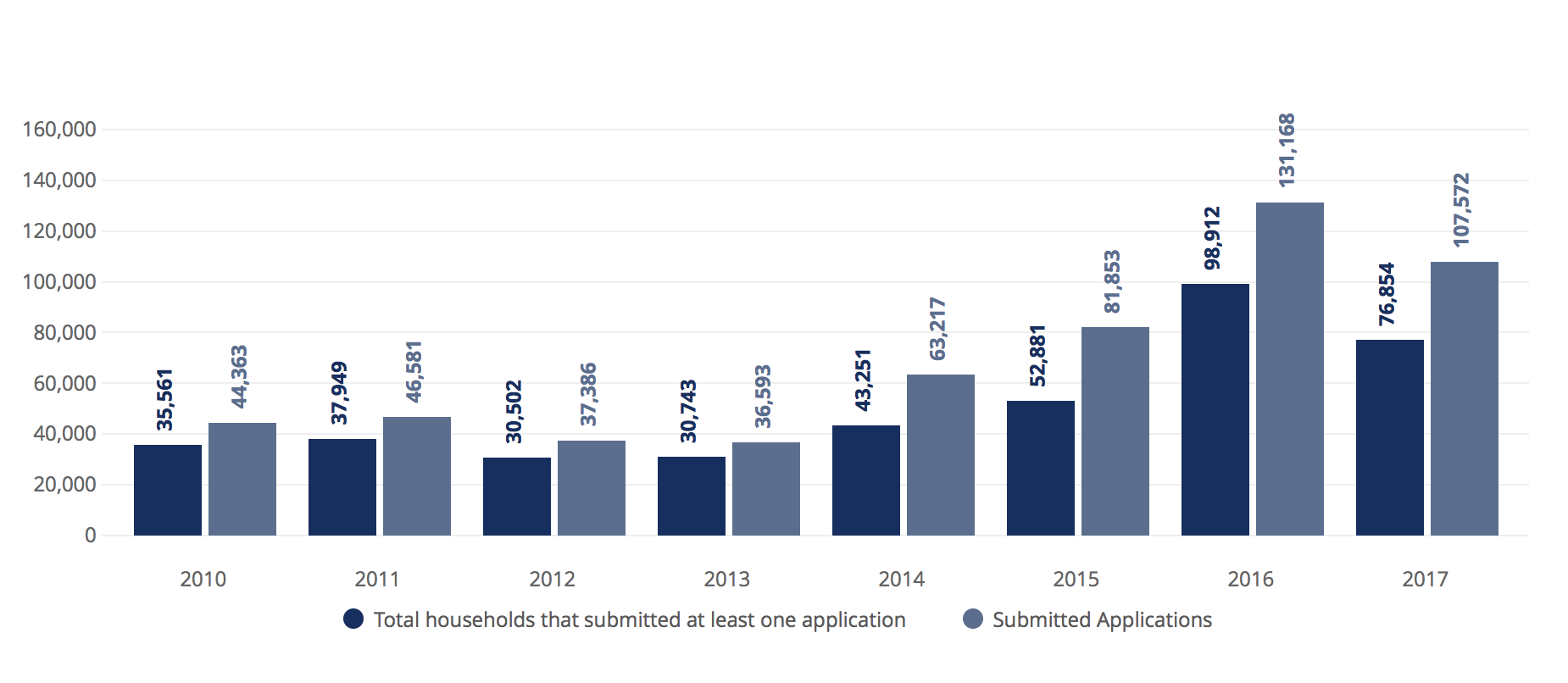
The visualization below summarizes BDT’s impact over the past eight years. The dark blue bars show how many households we helped apply for benefits, and the light blue bars show the number of applications we submitted. The visualization clearly tells a story about the trajectory of BDT – the first key characteristic of good data visualization. Without looking at the numbers, it is clear that BDT had steady impact from 2010 to 2013, and since 2014 the organization has seen annual growth, both in terms of households served and in total applications submitted.

If we trace an imaginary line over the upward trajectory of 2014 and 2015 through 2017, we can see that something unprecedented seems to have occurred in 2016. What was different about this year? If these numbers were displayed as text in a table, the trend may not have been as obvious. The visualization of this information taps into the creative side of the viewer’s brain, inspiring curiosity about possible explanations. In this case, the 2016 numbers are the result of an 18-month contract with the Pennsylvania Department of Human Services in which BDT submitted 65,000 “Fast Track” Medicaid applications.
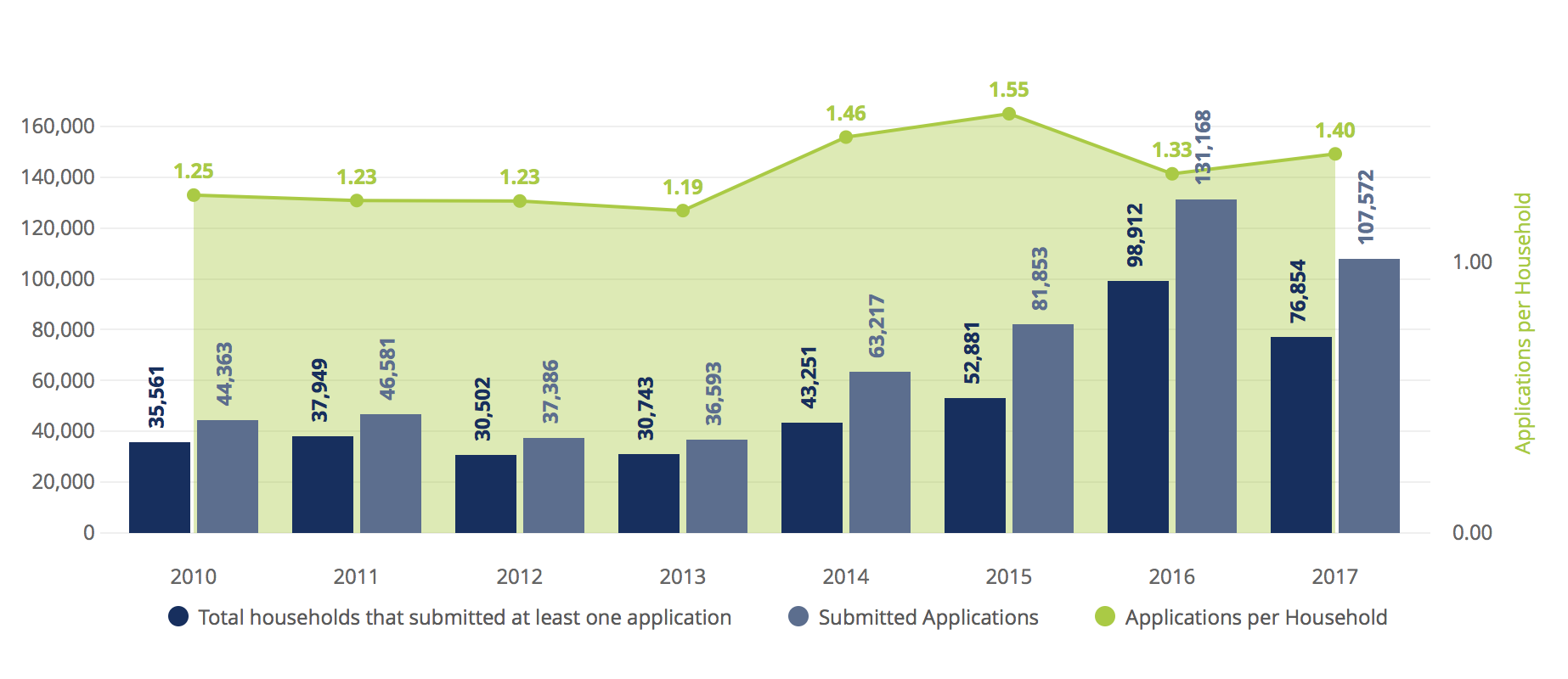
What else can the visualization tell us about the relationship between the number of households served and the number of applications submitted? Both sets of bars get taller, and it seems as if the distance between the bars is also growing. This might suggest that in addition to helping more households, we are also assisting these households with more benefits. To assess this, one can add a new measure (Applications per Household) and plot it on the right axis. Adding this measure to the visualization immediately confirms that we were helping clients with 1.2-1.25 benefits in the earlier years and now apply households for 1.4-1.55 benefits. With visualized data, the user is able to easily understand three distinct concepts (households served, total applications, and applications per household) and their interactions over time. Visualization has dramatically simplified the complexity of this concept, allowing users to dedicate cognitive energy to curiosity and exploration of additional data questions.

This is just one example of a single data visualization that allows us to understand a high-level organizational trend. Data democratization allows users at every level of the organization to replicate this process around the information that is meaningful to their day-to-day decision making, allowing for truly scalable, data-driven impact.
